
Case Study: Pro-Sys
Creative Brief + Overview
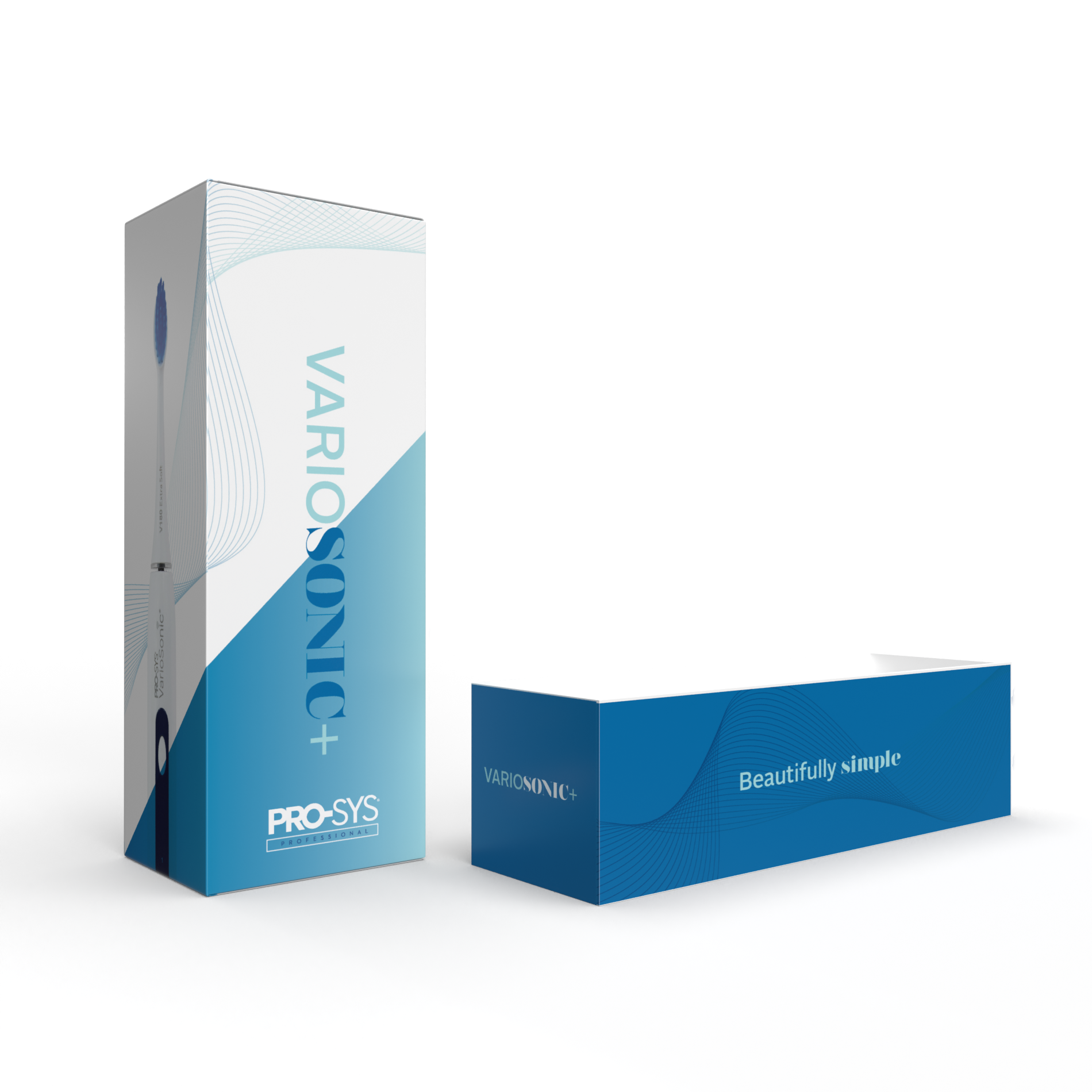
Pro-Sys® VarioSonic® is a private Benco Dental brand electric toothbrush that was launched in 2018. They sell most of their electric toothbrushes to dentists so they can re-sell to patients. They sell a smaller amount direct to consumers on Amazon and on their web site, Pro-Sys.com. When they launched the VarioSonic in 2018, they made the decision to go with a package design that they describe as clinical.
•••
New model in 2024 will have the following enhanced features:
Separate on/off and mode button • Pressure sensor • Improved and advanced brushing modes
•••
Do not have to follow any current branding guidelines although they are aiming to
keep their current Pro-Sys logo and are changing the name of this VarioSonic model
to VarioSonic Plus which can be completely rebranded.
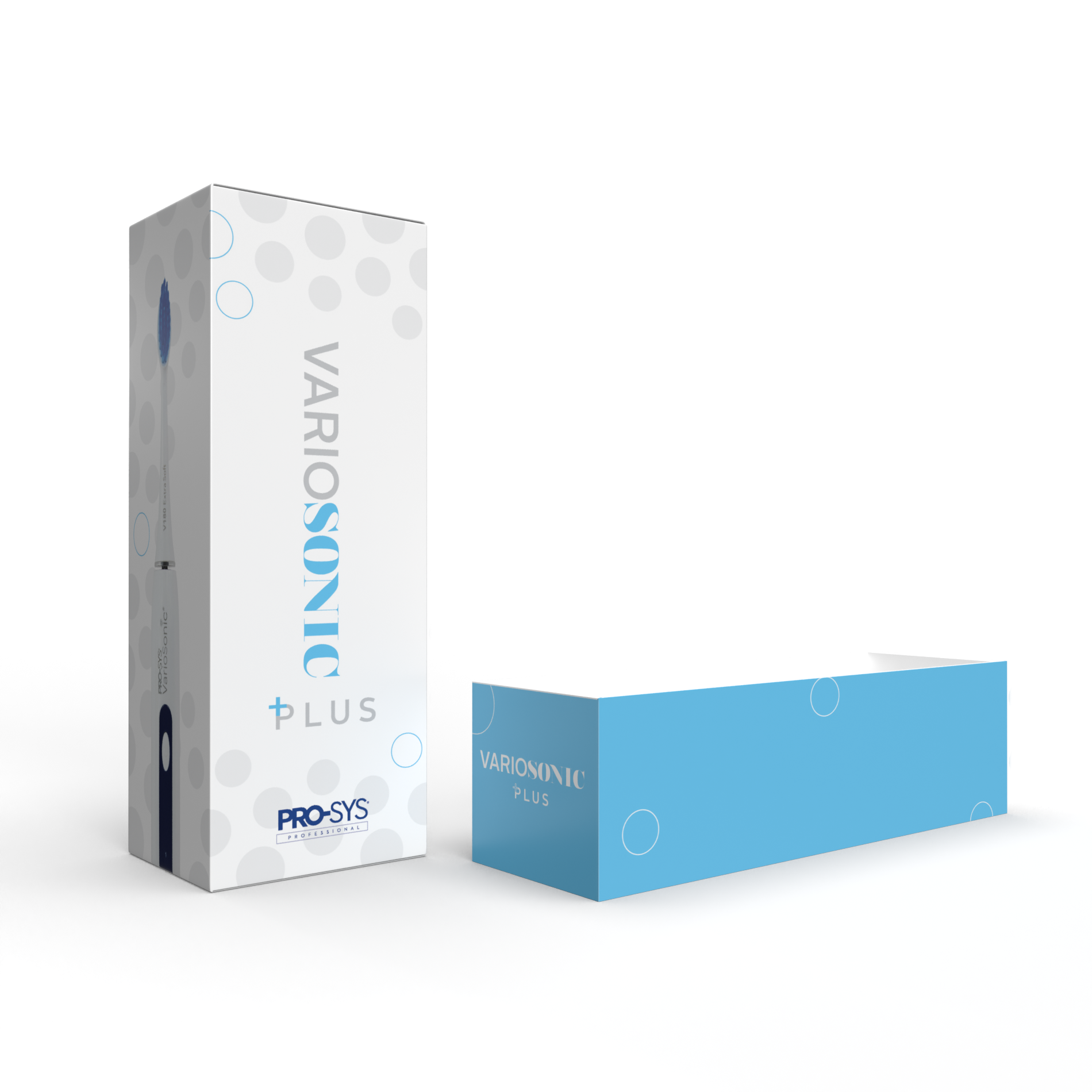
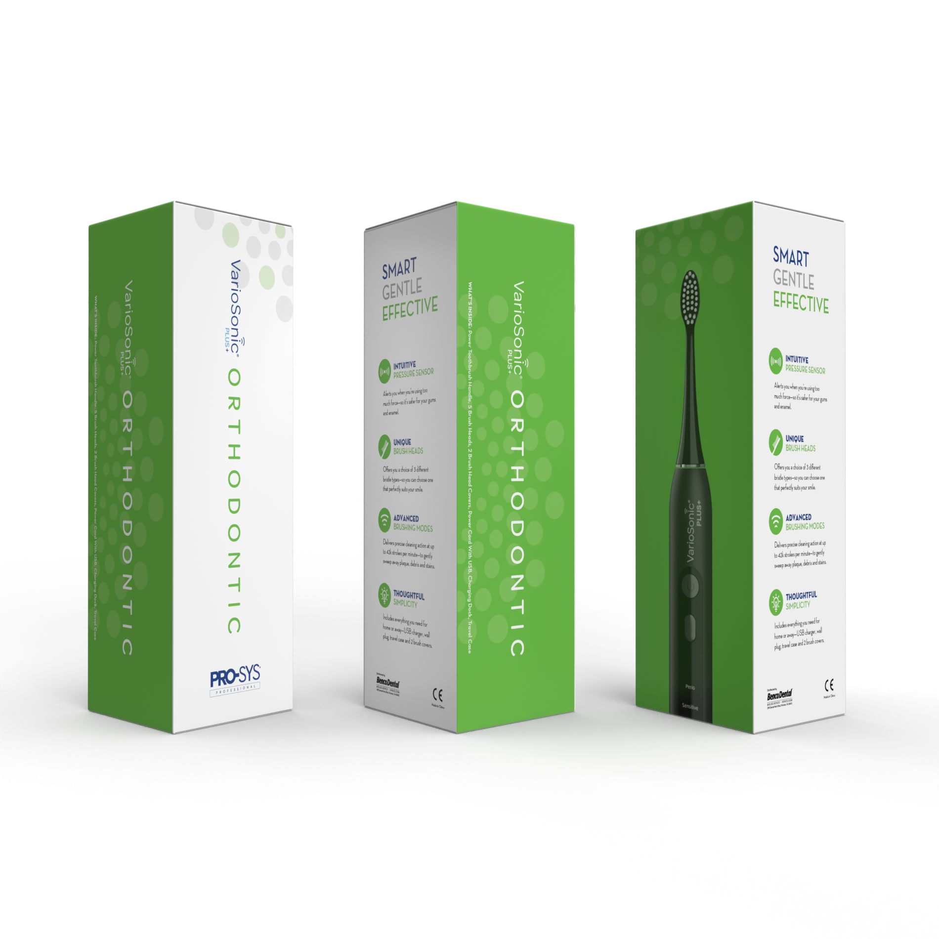
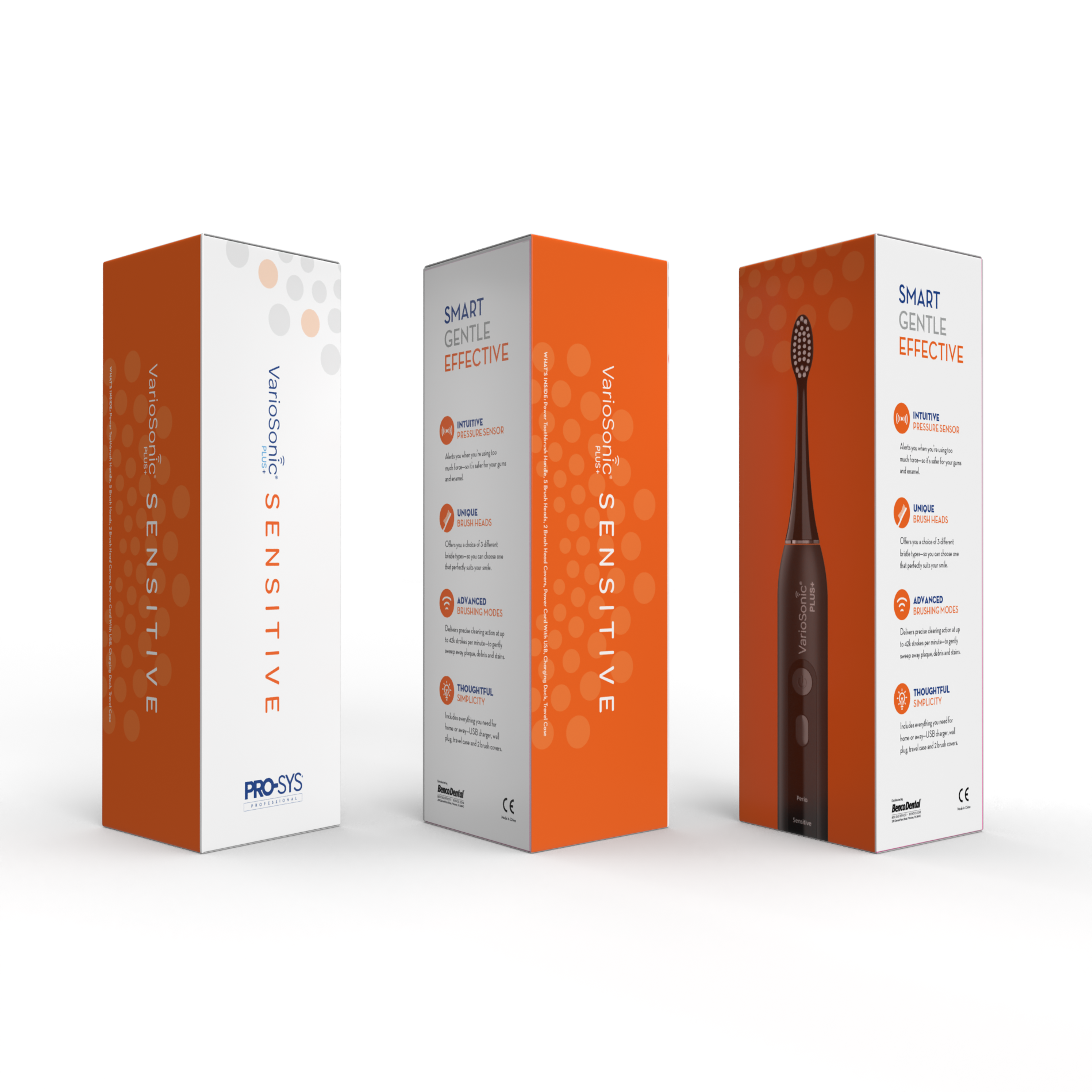
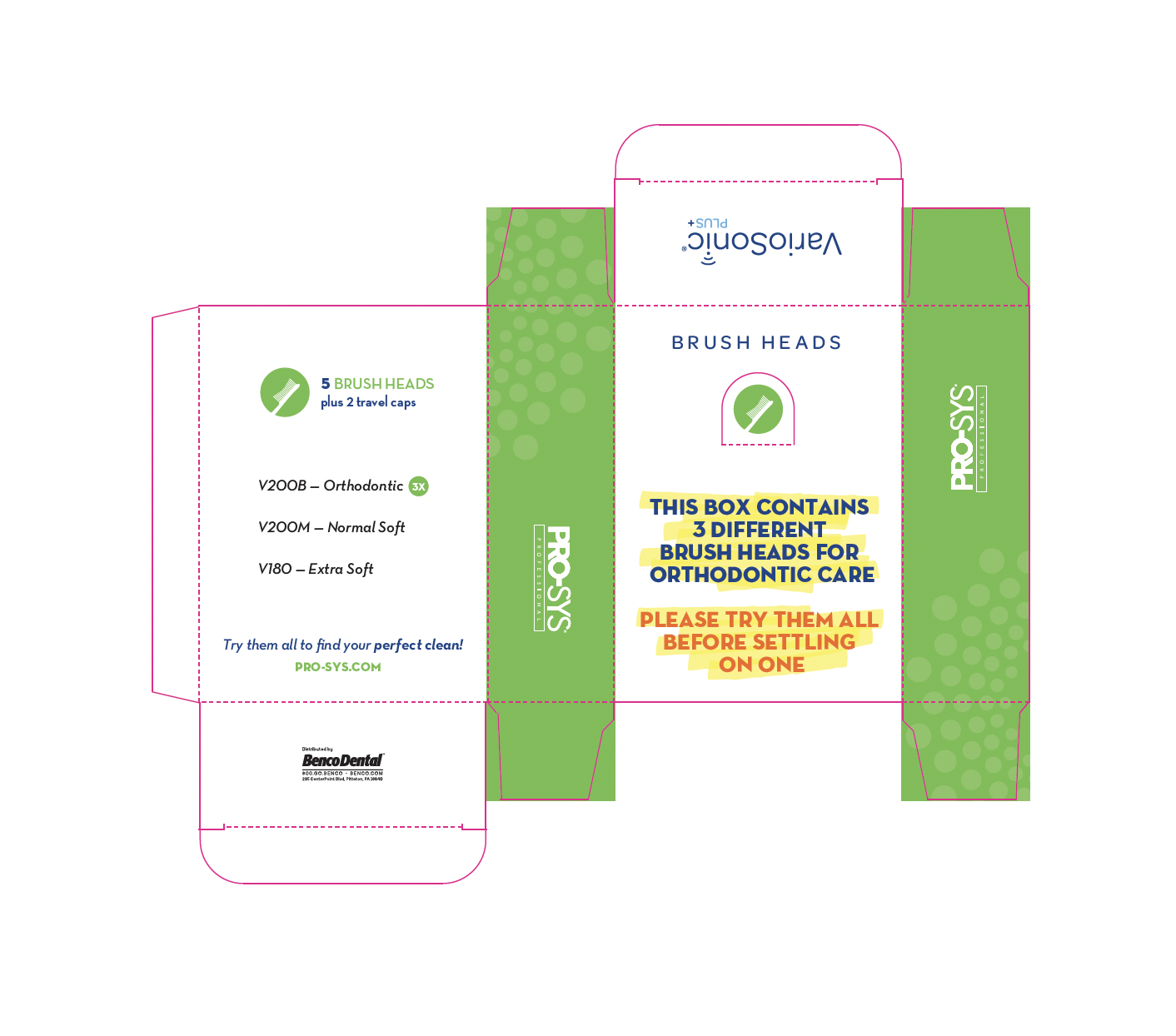
The new toothbrush will launch in two different colors, black and white along with two specialty toothbrushes (Sensitive and Orthodontic). Can design one package that works for both black and white colors or can opt to create two different designs, one for black and one for white.
Creative Problem
Looking for a new package design that will give them a more modern look,
but will not completely remove some of the clinical appeal important to our dentists.
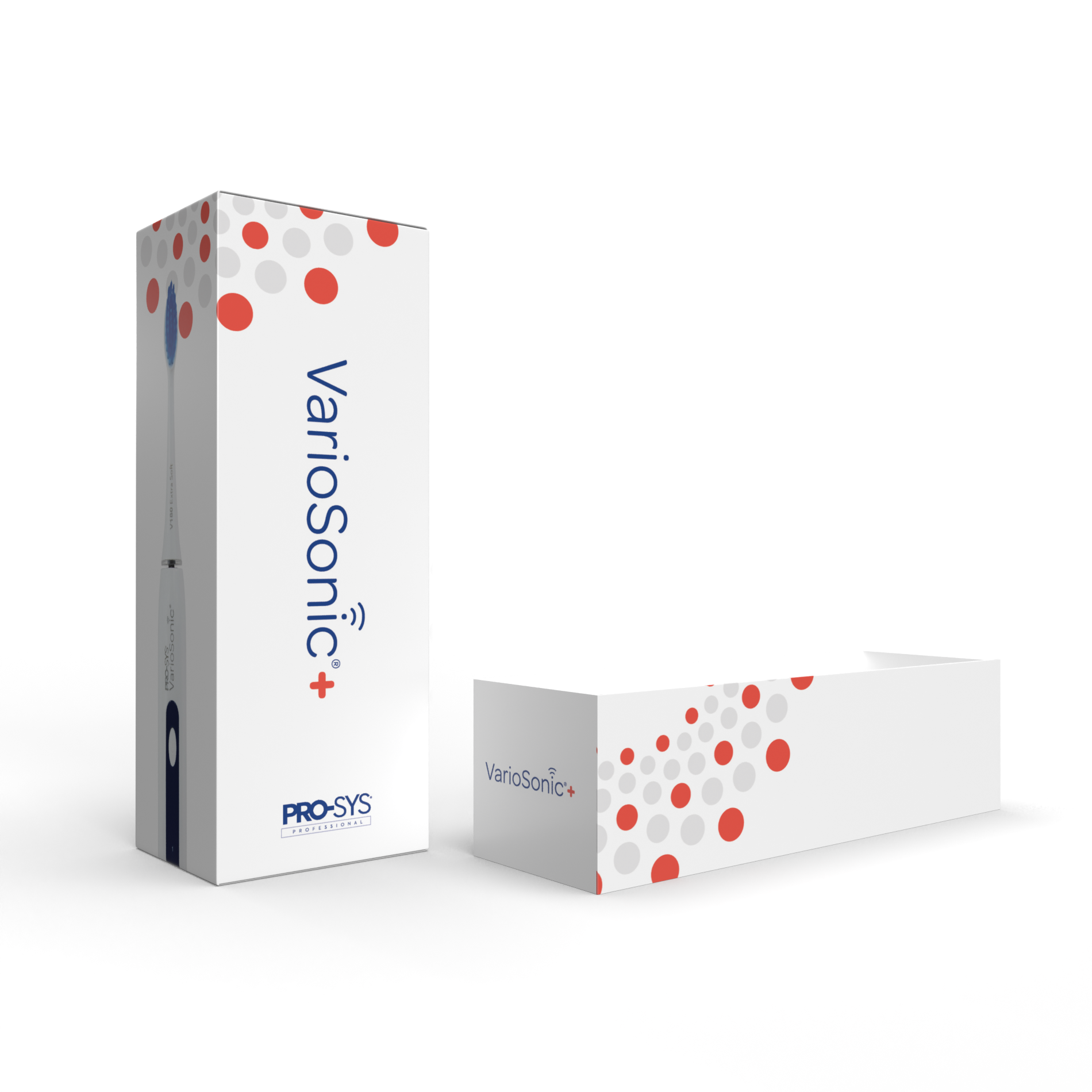
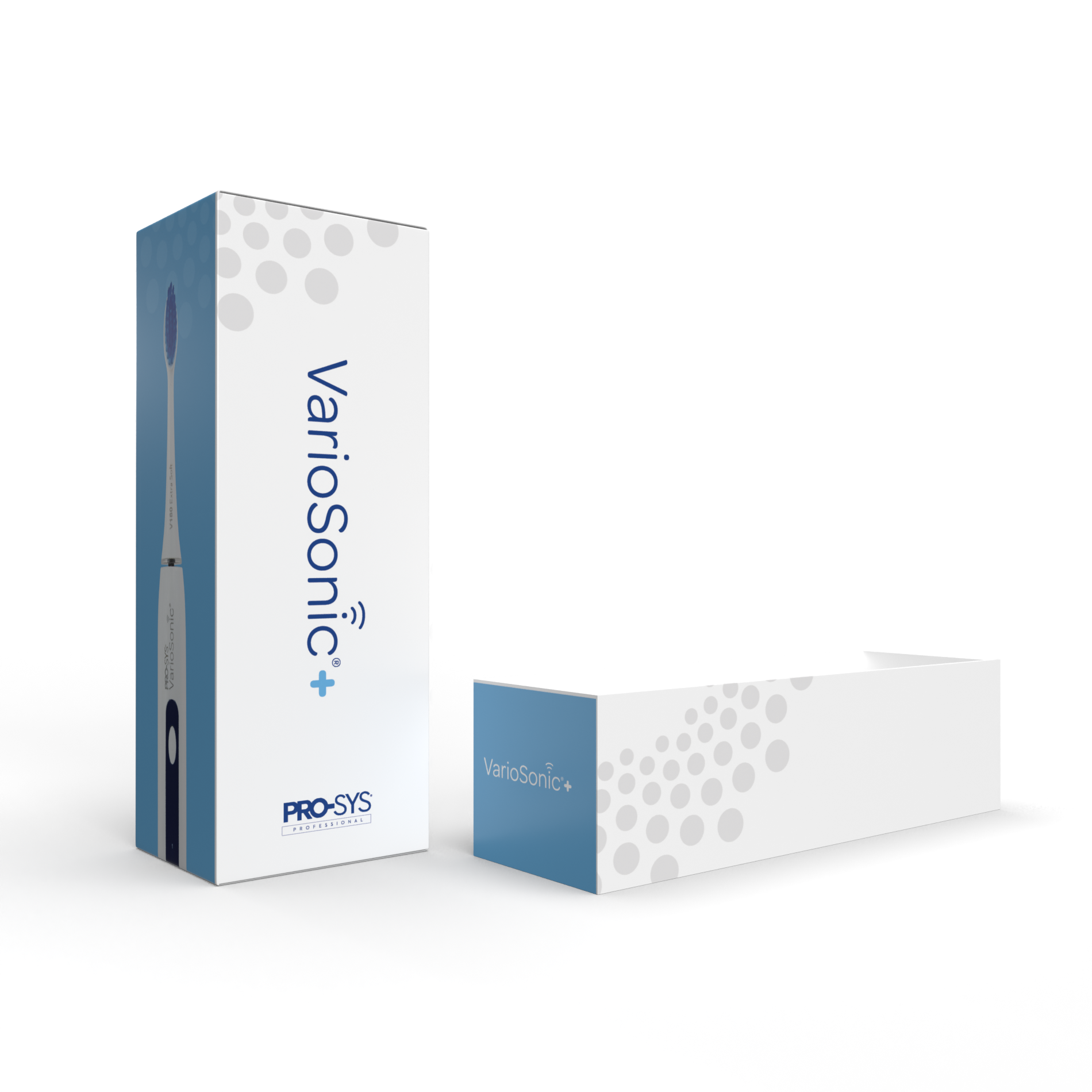
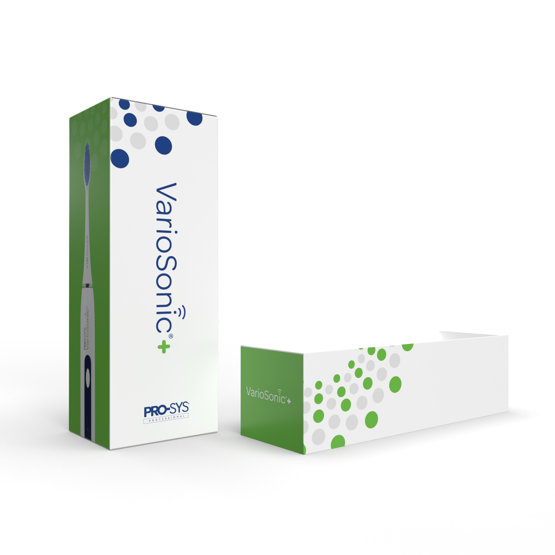
Round 1 Concepts
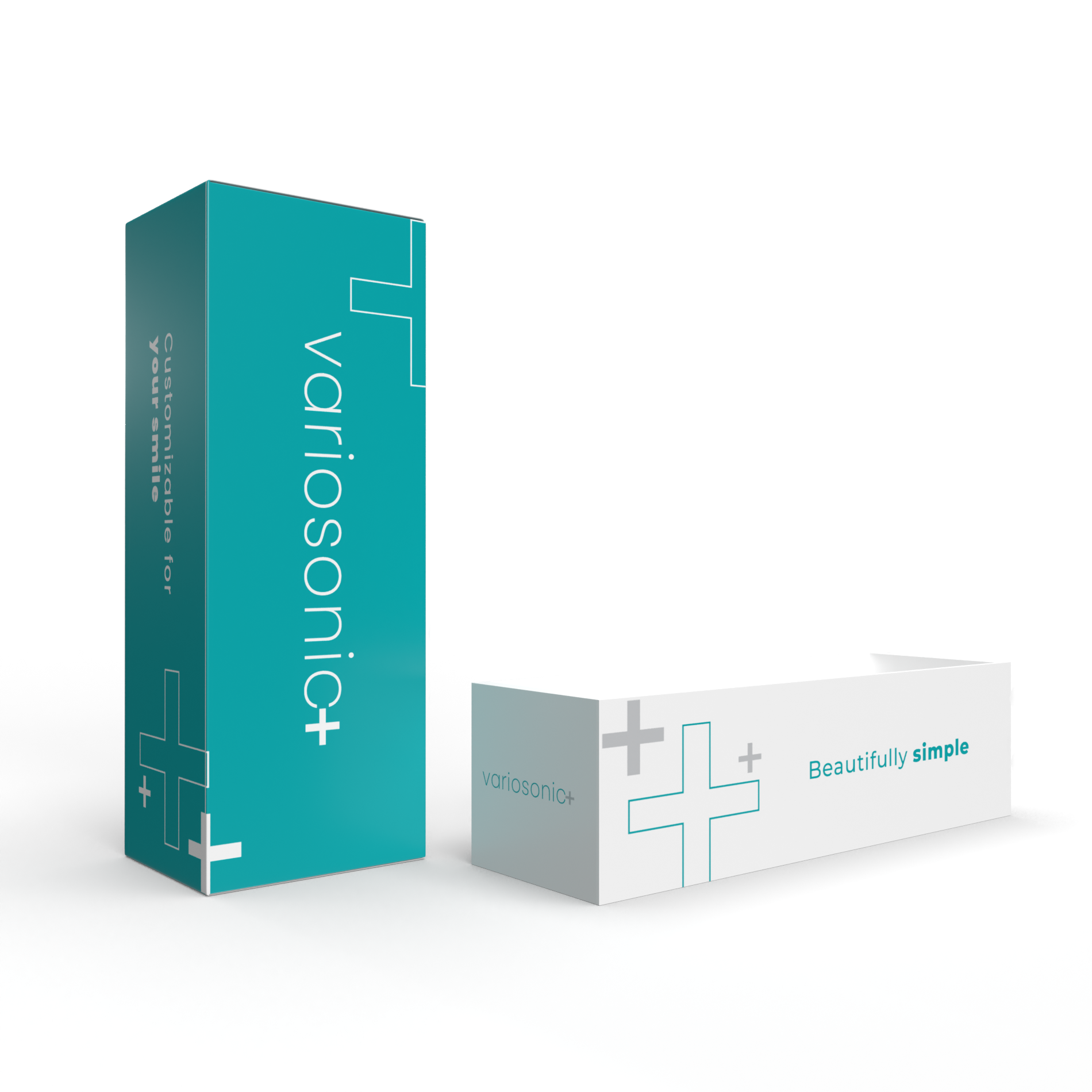
The creative solution was balancing the modern and clinical as well as keeping in mind that it is both a B2B and B2C product. Male patients chose the black brush more often while female patients chose the white. Since the brand refresh allowed to experiment with the VarioSonic logo, a few revamped options were presented. Four concepts were given with different designs for the black and the white but only varied by color palettes. The colors used were mostly from their current style guide for Benco Dental while introducing some new modern options that still paired well with their current colors.

Concept 1: Black Toothbrush
Concept 1: White Toothbrush
Concept 2: Black Toothbrush

Concept 2: White Toothbrush

Concept 3: Black Toothbrush
Concept 3: White Toothbrush

Concept 4: Black Toothbrush

Concept 5: White Toothbrush
Round 2 Concepts
Stakeholders wanted to bring back the dots originally used for the previous packaging throughout the Pro-Sys brand and pairing it with the chosen VarioSonic logo and colors.
Stakeholders decided to add the word “plus” while keeping the actual + sign. Creatively, it was added as a graphical element.

Concept 1: Black Toothbrush

Concept 1: White Toothbrush

Concept 2: Black Toothbrush
Concept 2: White Toothbrush
Concept 3: Black Toothbrush
Concept 3: White Toothbrush
Concept 4: Black Toothbrush

Concept 4: White Toothbrush
Round 3 Concepts
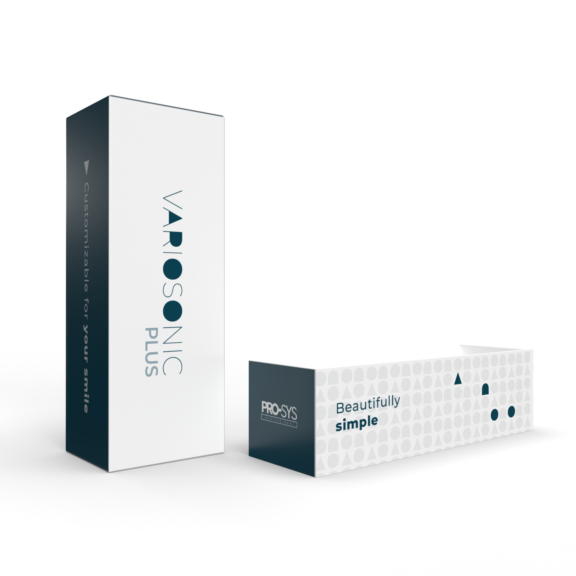
Stakeholders feedback was to revert back to the original VarioSonic logo paired with only the + sign. Additionally, experimenting with color combinations and which panels to add color to and having one design for both the white and black brushes.
Concept 1: Black Toothbrush
Concept 1: White Toothbrush

Concept 2: Black Toothbrush
Concept 2: White Toothbrush

Concept 3: Black Toothbrush
Concept 3: White Toothbrush
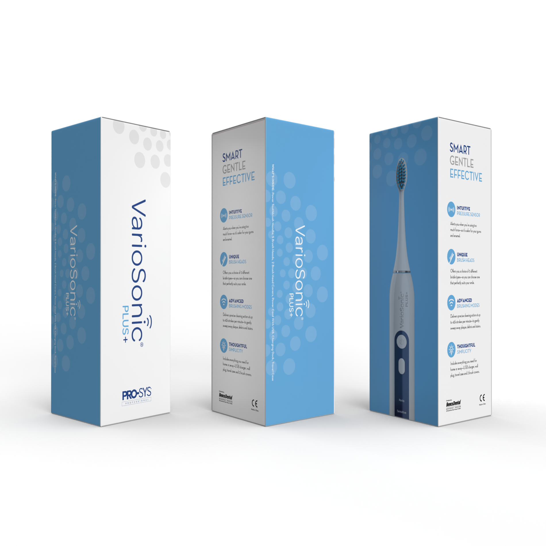
Round 4 Finals
Final feedback was to add the word “plus” back into the VarioSonic+ logo and the light blue concept from round three was chosen. It was noted to the stakeholders that it would read as “VarioSonic Plus+”. Also added was the specialty brushes since the final brush box design for the black and white was chosen.
Additional Materials
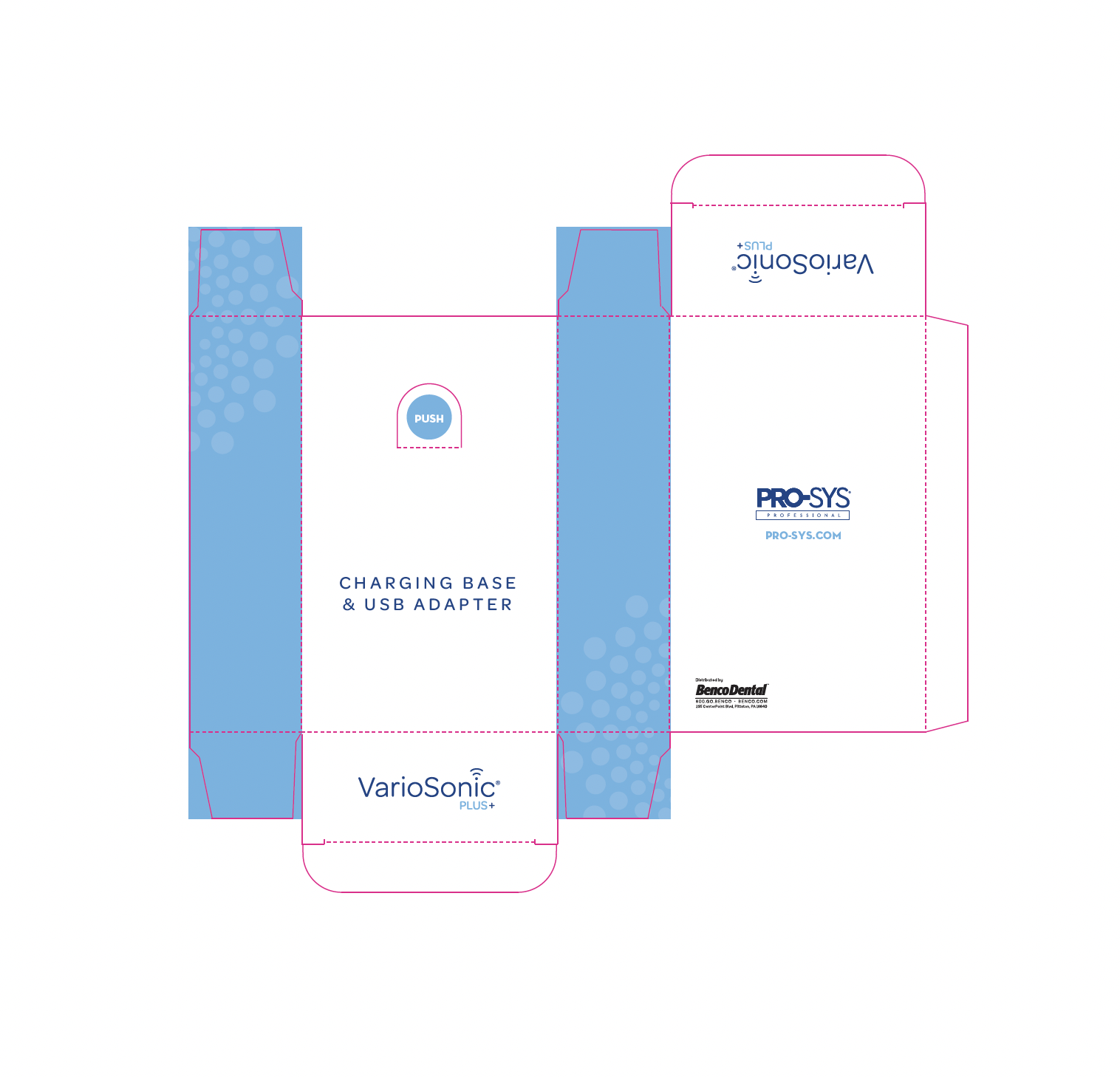
Additional materials completed after included: box inserts, cards and accessory boxes
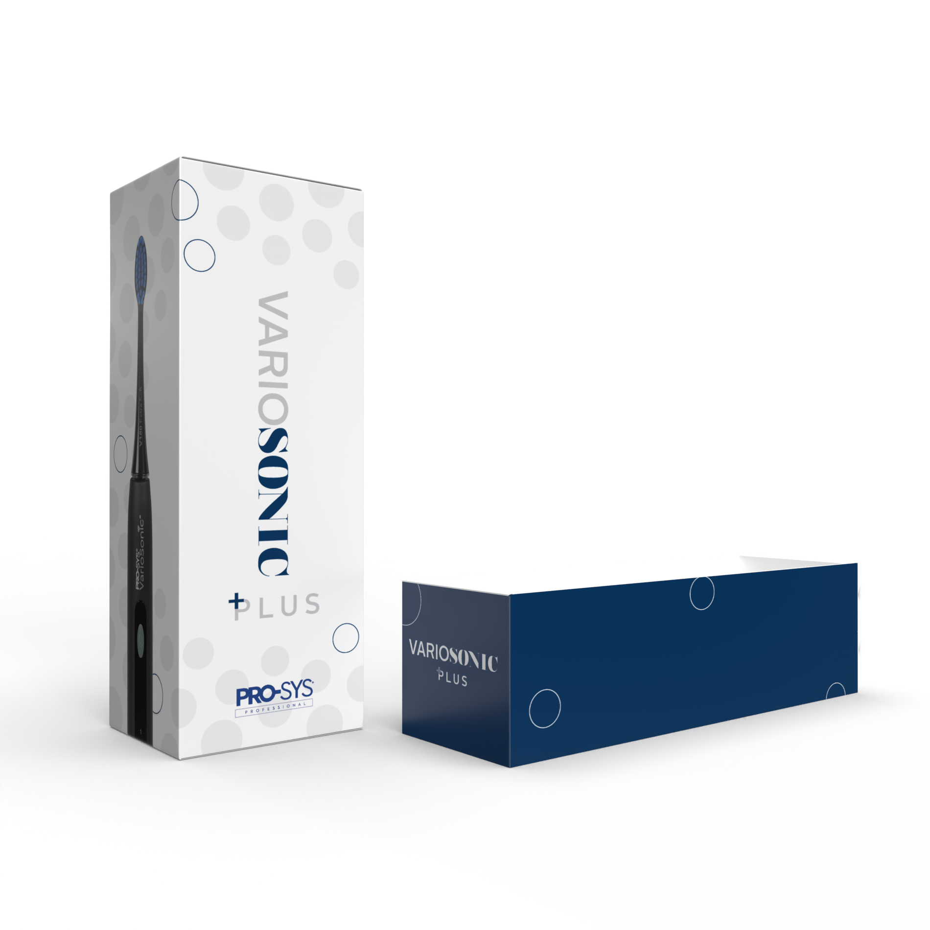
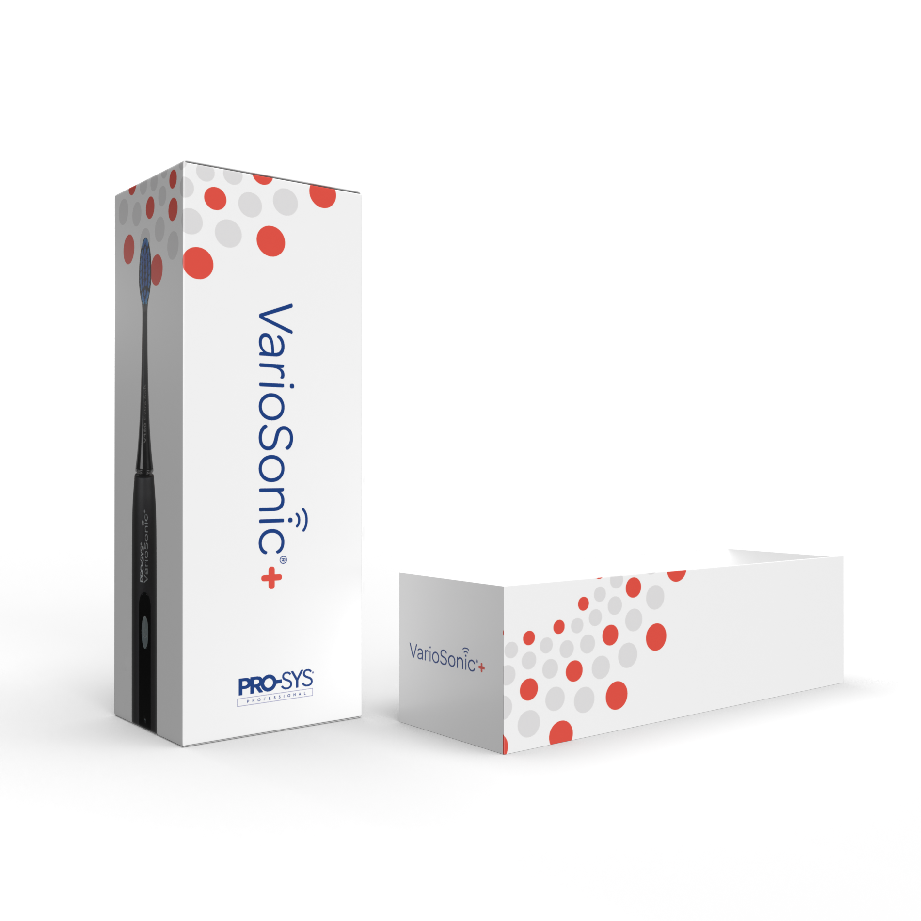
ACCESSORY BOXES: ORIGINAL DESIGNS
The charging base & USB adapter box is the same in all the brush boxes.
Creative solution was to keep that as one design to help with cost.
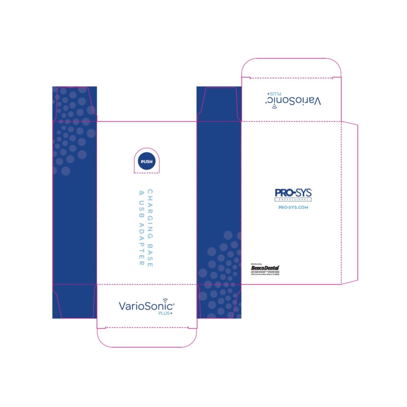


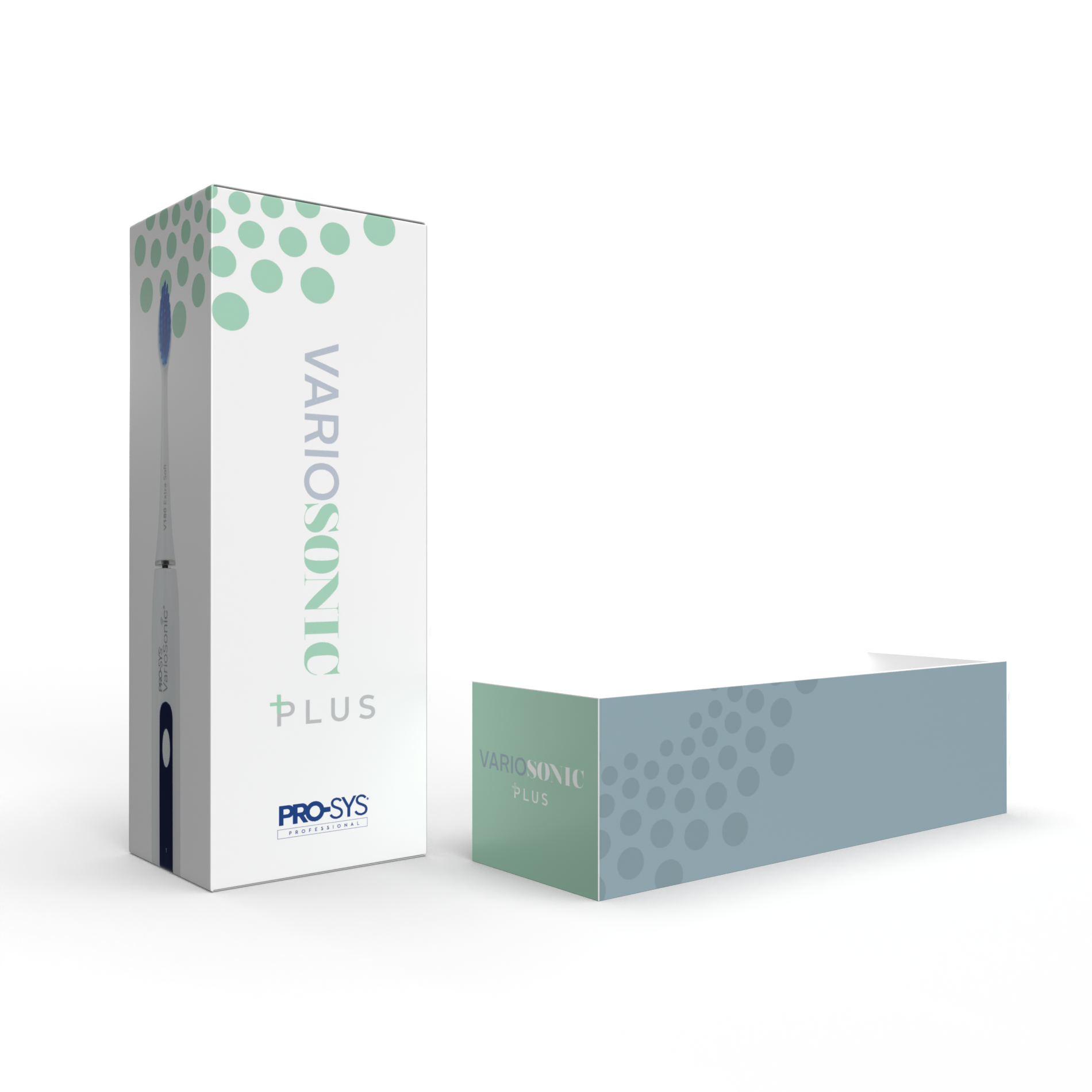
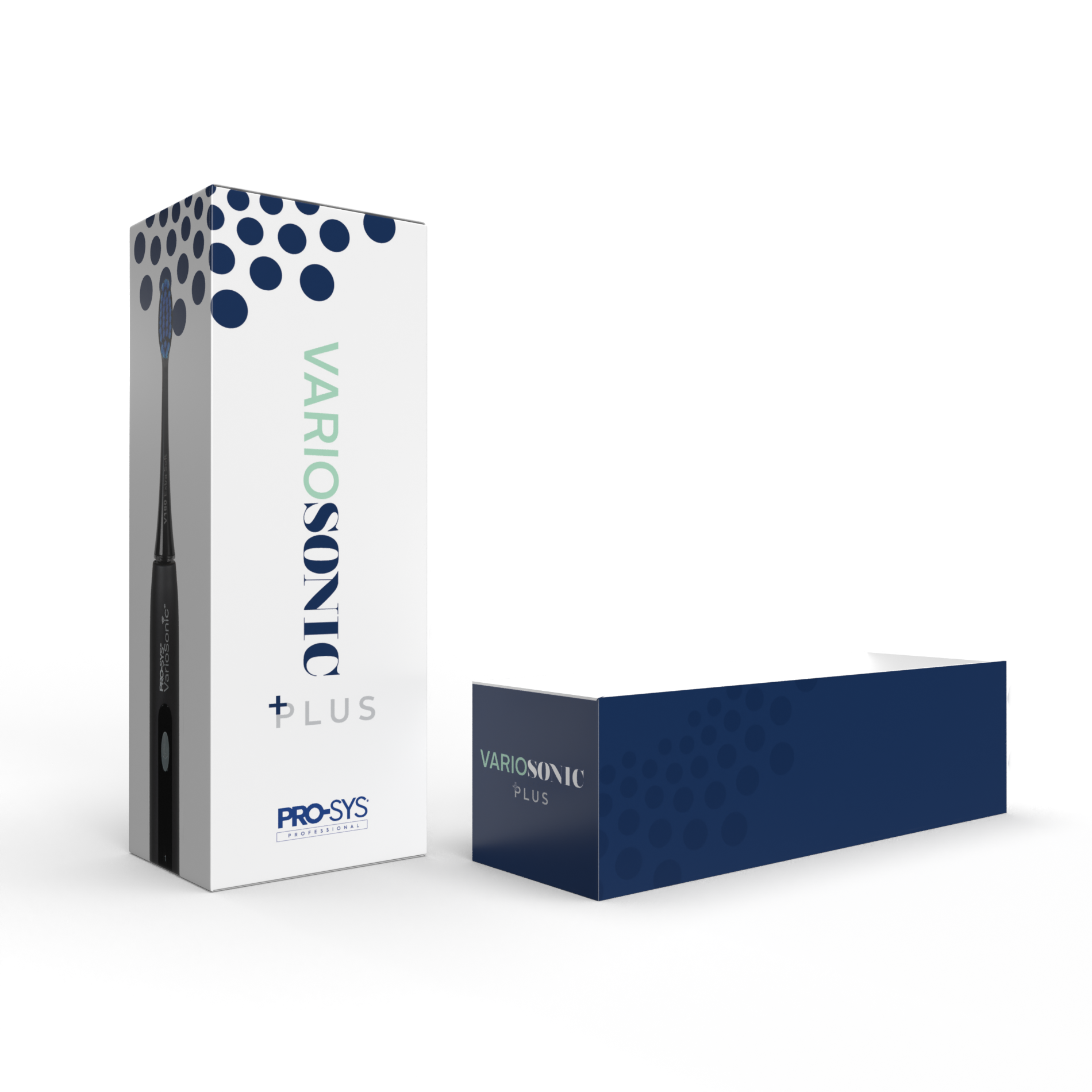
ACCESSORY BOXES: FINAL DESIGNS
The final decision from stakeholders was to approve the additional cost and match the colored panels to the brush box. Additional feedback was to add CTAs.


IFU: FINAL DESIGNS


